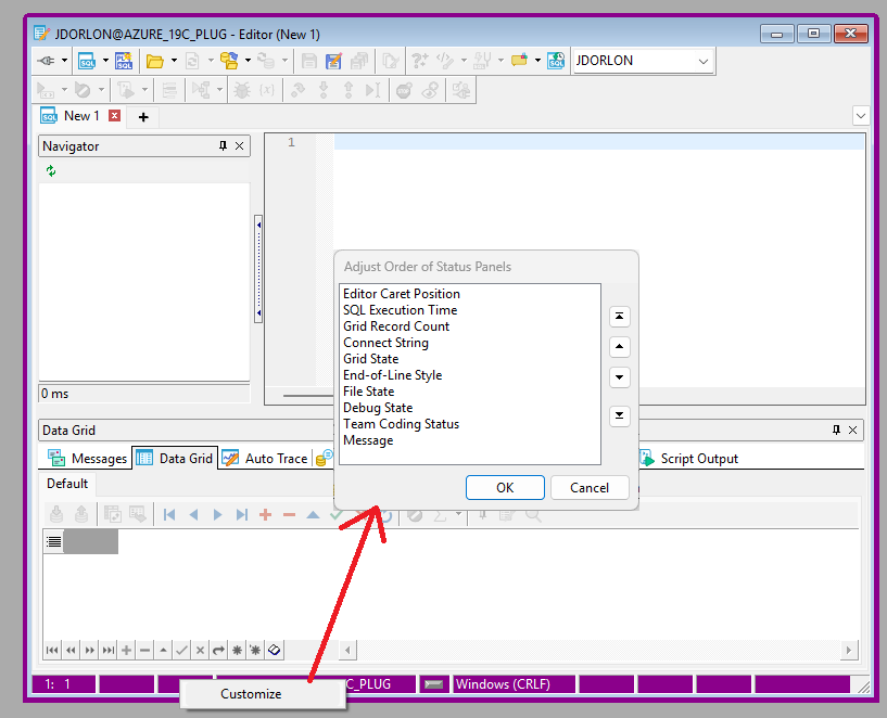
Is there someting published that details the content in the info segments at the bottom of the editor. The ones I don’t see/know are in question marks: editor position, execution time, ?, connection,?, EOL conversion, save status,?,?, transaction status time/rowcounts.
My only beef is with the super far right placement of the last one transaction status time/rowcounts which is the only one I really find useful. It’s always to the far right of any editor content at around the 130+ character position. I’m still from the 80 characters per line camp and don’t code lines to the 100+ character range since some poor fool will be forced to look it it on a UNIX screen in the future. Do we really need a 3 connection labels: editor top and bottom along with the active connection sitting at the top next to the Toad logo? I just had a 5+ year daily Toad user tell me that they have never seen the Update rowcount in the bottom right. I just hate having to expand my editor across the whole monitor to see it when all of my <80 character SQL is at the left of the screen. I get that it may be last for the variable length messages, but I’m curious about what it is losing out to on the left.