For a while now, when I display the graphical version of the access plan in the session browser, it displays slitghtly garbled:
Mine does something similar, although explaining it again clears it up. My layout is different, with temp space, cost, io cost, cpu cost, cardinality, and bytes in their own columns, next to the plan text.
I’m not sure about Abe, but I can reproduce it consistently by adjusting the width of one of the columns of the plan (e.g. CPU Cost, as it’s never wide enough) and explaining the query again.
it happens consistently, however, it is not Always equally visible.
I just tried to capture it, but after opening the screen-scraper, the screen had already been fixed.
So, I’ll try it in a verbose way, lacking a better method.
I open the session monitor, select the batch job I want to monitor.
Then I go to the long-ops tab, it shows a long list of tasks completed and/or in progress.
Next I go to the Current_Statement tab, which defaults to the Explain_Plan subtab.
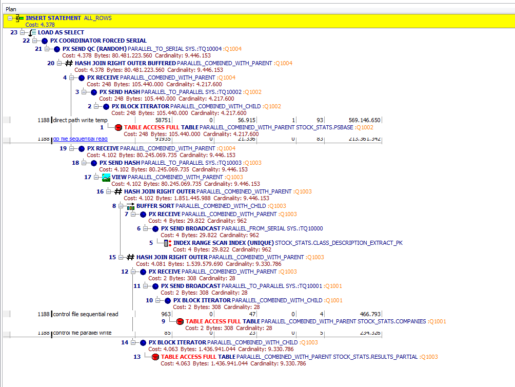
The plan is shown, but the screen appears not te be completely written.
Bits and pieces of the peviously displayed page remain. Especially the green pieces stand out, but in between the text lines, some of the long-ops text remains visible.
Upon redrawing the screen, the effect is lost. Also, it happens only on the first time I do this.
To reproduce I need to exit session browser, then restart it…
I hope this helps. If you have any other questions, please don’t hesitate.
It’s not really a very big deal, just an annoyance.
John, I still have an issue with Explain Plan pane painting. It’s somewhat intermittent but happens in Editor, Auto Optimize SQL, Session Browser. Usually happens now when I’m scrolling through the Explain plan Tree display. Sometimes it’s very subtle and I only notice when my mouse pointer passes a line and it corrects itself. In Auto Optimize SQL window, it’s more obvious for me and I can reproduce consistently with the SQL I’m tuning, in case you want more details.
For me, that particular explain plan is larger than the display. Scrolling down using the vertical scroller works fine. But scrolling by hovering my mouse in the explain plan area and using the mouse wheel corrupts the display. That will only happen if the explain plan has not already been “properly” scrolled with the vertical scroller widget.
Possibly relevant, I have DisplayFusion Pro that has a setting of “Allow the mouse wheel to scroll windows under the mouse cursor that are not in focus” enabled, although the window is in focus when scrolling. Thought I’d mention it just in case…
For that explain plan, scrolling with the mouse wheel, the full table scan icon shows up as green and when my mouse passes over the line, it changes to red. If I use the vertical scroll bar, while mouse is pressed and scrolling, display is distorted, but as soon as I release the mouse button, the display corrects itself, including icon colors and line formatting.
And, as Rich has pointed out, once you scroll through the entire plan and it corrects itself, and further scrolling back and forth for that plan shows up fine.
Yeah I see what you mean if I enable the Access Predicates or Filter Predicates columns. Interestingly, if I rearrange the columns so that the plan column is first, then the painting problems of the access/filter pred columns goes away.
I don’t have any of the options enabled as columns so I only have the Plan column visible (and, of course, it is the 1st column). Many times happens on the Cost line or just above it, though sometimes affects the icon coloring.
What window do you see it happen most often in, Dale? I’m trying your user settings folder with EP in the Editor and Session Browser and so far it looks fine.